Alert notification
Updated:
May 4, 2020
The alert notification can be displayed in different versions based on the alert level.
Variations
The alert notification can be displayed in different versions based on the alert level.
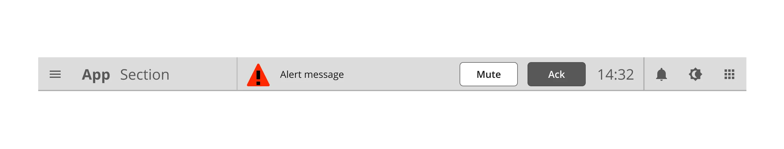
Topbar with alert
Alerts pops up in the topbar.
Topbar with alert
Alerts pops up in the topbar.
Component building blocks
How the Alert notification are built up and styled.
Anatomy
The alert notification is a nested component with text and UI components.


Component elements
1
Border
2
Stepper Container
3
Label
4
Standard button
5
Standard button
6
Colors and styles
The Alert notification use standard colours for text and dividers. Go to the Alert icon page to see color definitions for the alert indicator.

Element
Color / Style name
1
Border
This is some text inside of a div block.
2
Label
This is some text inside of a div block.
3
Label
This is some text inside of a div block.

Element
Color / Style name
1
Border
This is some text inside of a div block.
This is some text inside of a div block.
2
Label
This is some text inside of a div block.
This is some text inside of a div block.
3
Label
This is some text inside of a div block.
This is some text inside of a div block.

Element
Color / Style name
1
Border
This is some text inside of a div block.
This is some text inside of a div block.
2
Label
This is some text inside of a div block.
This is some text inside of a div block.
3
Label
This is some text inside of a div block.
This is some text inside of a div block.

Element
Color / Style name
1
Border
This is some text inside of a div block.
This is some text inside of a div block.
2
Label
This is some text inside of a div block.
This is some text inside of a div block.
3
Label
This is some text inside of a div block.
This is some text inside of a div block.
Typography and icons
The label tells you about your location in the application and makes it easy to access other parts.

Specs
This component is built up by a oval slider and icons.

1
Component measures
2
Spacing
3
Border sizes
1
Component measures
2
Spacing
3
Border sizes
States
No items found.
